Symposiadd
Prototyped networking app designed to strike valuable conversations between young creatives and entrepreneurs.

Young professionals in creative and entrepreneurial fields need to connect with other like-minded individuals in a comfortable and authentic place. Networking is important in creative careers, and having conversations is key to making those connections.
Although many networking sites exist, very few cater directly to the young creative or entrepreneur. Symposiadd fills this gap by providing a professional setting for networking between young professionals while also making it fun, informal, and authentic.
This project covers producing the app from the ideation to prototype stages, which includes research, logo/visual identity design, information architecture, and UI kit development.
Ideation
The process began with creating the initial concept of the app. I used a fill-in-the-blank prompt to generate ideas.
“My idea is like ____ only it is like _____ and it will function (like/by/as/etc.) _____.”
My idea is like Slack only it is like Reddit/Twitter/Mastodon and it will function as a centralized place where people can send messages and share files about certain topics that are important to them.
The next part of the ideation phase was to come up with a unique name for the app. Focusing on the idea of communities around certain topics, the name “Symposiadd” was created based off the Greek term “symposia",” the plural form of “symposium.”
In the same way that a symposium revolves around a certain topic, the app will have multiple channels for different discussions. There are many channels, and any person can be added to the conversation.
Research
After the ideation step, I then created objectives for the project, as well as four different user personas. The objectives focused on determining what the designer and the user out to receive out of the app.
While the main objective of Symposiadd is to create a social networking application that connects users in an authentic, “be yourself” setting, the design also seeks to limit the negative impacts of social media as much as possible. Having done previous research for a white paper, I discovered that many of the negative effects of social media can be countered with improvements to user intentionality and app design. For example, Symposiadd will not have a like button, and posts will be boosted based on human interaction in the comments section.
Success metrics were also created, in order to determine which features of the app should be specifically focused on during the prototyping stage. These metrics include a high amount of authentic conversation, community building, the ability for users to gain work or jobs through the app, and support donations to other users.

Mural board of competitor research.
Structure
The information architecture of the app divides the app into five distinct parts, which will serve as its main menu options. User flows were also developed in order to visualize the steps it takes a user to complete a specific task on the app.

Logo and Identity Design
First, I conducted research on other logo designs for social networking sites, as well as technology-focused companies. After the visual research, I created some sketches on paper and narrowed my options down to three different variations.
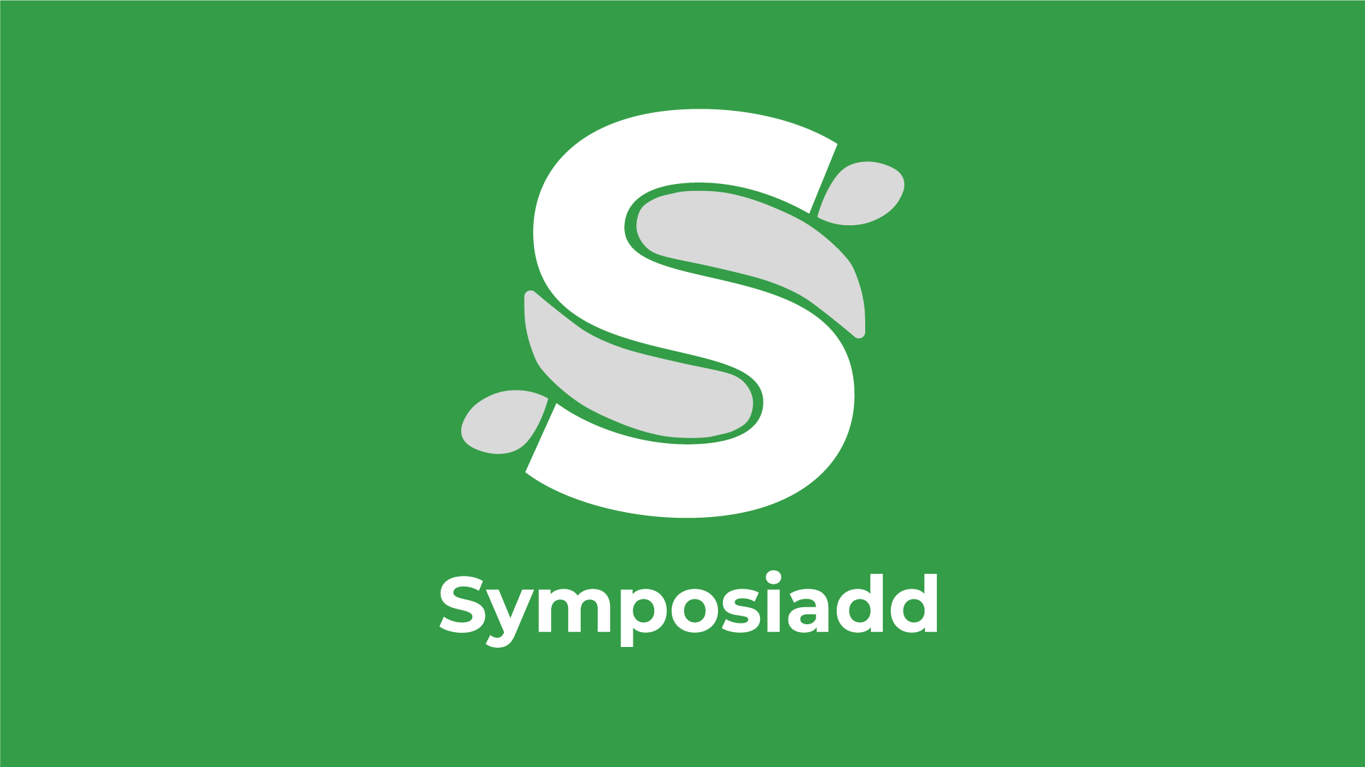
After creating the variations, the decision was made to create an icon based on the letter “S” that could be implemented into the wordmark.


Initial logo variations. The concept of the first was further developed.
Many variations of an abstract S icon were made. But in each option, the white space was not effective in conveying the shape of the letter. An outline of an S was added to the strongest option, but still fell short.
After review, a suggestion was made to model the icon’s S shape after the letter’s appearance in Montserrat Bold, which was the typeface I determined for the app. After adding dimension through the use of color to make the icon less flat, this became the finalized logo.

The final icon’s progression.
UI Kit
For visual consistency, I developed a UI kit that will keep elements consistent across the whole app. This includes heading and paragraph typefaces, colors, sizes, and icons.


Prototype
The prototype demonstrates the basic tasks for users on the app, including user flows for new and returning users and the main menu items.

Feed
The app’s main feed shows the posts of users followed across channels.

Connect
A Tinder-inspired feature that lets users swipe through user and channel profiles with the opportunity to follow or join.

Channels
Post to the whole group, or share within channel-specific chats.

Profile
Users can showcase their previous experiences as well as what’s currently on their mind.